Kurzbeschreibung
The students learn to analyse interpret scientific weather data and how they can be used to characterise the local climate. They apply the statistical tool of averaging and learn to construct and use the climate charts.
This resource is part of the educational kit "The Climate Box". You can read more about the kit in the presentation attached. Find all related resources selecting the category "Our fragile planet" and "secondary level".
Ziele
The students will understand that the climate is the long term average of weather activity. They will understand that climate zones are defined depending on the average conditions there. They will learn to apply and interpret climate charts according to Walter and Lieth.
Lernziele
The students will learn to:
- apply the statistical tool of averaging.
- transfer statistical tabulated data into scientific climate charts.
- become familiar with spreadsheet software (e.g. Excel).
- retrieve real scientific data from weather databases.
Bewertung
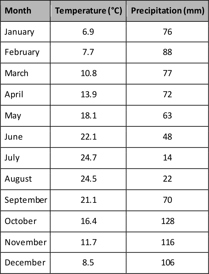
The tasks to be carried out comprise calculating means and drawing charts. Those results can be easily checked by the information provided for the teachers. The averages values are mentioned in the tables of the subsequent activities. The resulting climate chart for the location used in the worksheet is given as follows.
From this chart, we can conclude:
- Jena is in the Northern hemisphere.
- Jena has a temperate climate. The precipitation roughly follows the temperature evolution.
Materialien
- Worksheets
- Millimetre paper
- Pencils (black, blue, red, yellow)
- Ruler
- Computers with spreadsheet software, if available
- Internet access needed for task 3 for advanced students
- Pocket calculators (assumed to be private or school property)
Hintergrundinformationen
The climate
The climate is defined as the long term average of weather or atmospheric phenomena, often modified by seasonal variations. In order to make a statement about the climate, weather data have to be recorded over a large period, typically 20 or 30 years. This avoids confusion with short term contributions.
In addition, the Earth can be divided into climate zones with different ranges of temperatures and precipitation. They are produced by large scale atmospheric interactions or geological features. Besides the previously mentioned temporal average, those climate zones are defined via regional averages, coarsely aligned with the latitudes. The root cause for the latter observation is the regionally varying incident angle of solar irradiation. Various schemes for climate zones exist, but in general, they can be discriminated into four or five zones:
Tropical zone (between latitudes 0° - 23.5°)
- little seasonal variation of insolation
- very warm throughout the year
- humid, high precipitation
Subtropics (between latitudes 23.5° - 40°)
- most intense insolation during summer
- generally rather dry, little precipitation
- strong variation of temperatures between day and night (little protective cloud cover)
- winters can be rather cool and moist
Temperate zone (between latitudes 40° - 60°)
- lower incident angle of insolation
- cooler mean temperatures than in the subtropics
- seasons and length of day differ in the course of the year
- precipitation evenly distributed throughout the year, no or rare arid periods
Cold zone (between latitudes 60° - 90°)
- very low incident angle of insolation
- strong seasonal differences, little diurnal variations
- low temperatures
- amount of precipitation depends on geographical conditions

Figure 1: Detailed climatic zone map of the Earth distinguishing five major climate zones (Source: Peel, M. C., Finlayson, B. L., and McMahon, T. A.
(University of Melbourne), https://commons.wikimedia.org/wiki/File:Koppen_World_Map_(retouched_version).png, https://creativecommons.org/licenses/by-sa/3.0/legalcode).
Climate charts
A frequently applied tool to determine basic climate features of a given location is a climate chart according to Walter and Lieth. It is a graphical representation of the two main observable that characterise weather and climate: the temperature and the precipitation. The chart shows one value for either of the two quantities for each month. The temperature is the mean temperature of a given month, while for the precipitation the sum is displayed.
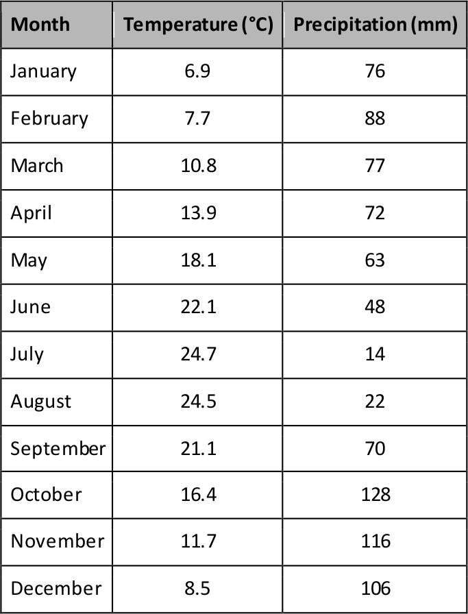
For explanatory reasons, an example for Rome in Italy is given. The chart is based on the following list of values, which represent a long term average of temperature and precipitation for each month.
The resulting climate chart according to Walter and Lieth is given as follows:
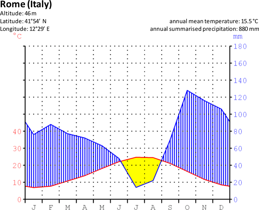
Figure 2: Climate chart for Rome, Italy. It illustrates the monthly mean temperatures and the corresponding added precipitation throughout the year (Source: Geoklima 2.1, https://heraldik-wiki.de/index.php?title=Datei:Klimadiagramm-deutsch-Roma_(Rom)-Italien.png, https://creativecommons.org/licenses/by-sa/3.0/legalcode).
The header of the chart for Rome lists some basic information about the location. Very often, it mentions the annual mean temperature and the summarised precipitation throughout the year. The chart itself has two scales, the red one to the left displaying the temperature in degrees Celsius, and the blue one to the right providing the precipitation (rainfall) in millimetres. For very high values of precipitation, the scale above 100 mm is compacted to steps of 100 mm (not in this example). The horizontal scale at the bottom lists the months through the year, abbreviated with the first letter of its name.
The red curve depicts the evolution of the temperature, averaged for a given month, as listed in the table above. The blue curve shows the evolution of precipitation as the sum calculated for a given month. The values are also listed in the table below. The red scale belongs to the red curve and the blue scale to the blue curve.
In order to able to derive climatic information from such a chart, the two scales must be adjusted so that 10°C correspond to 20 mm of precipitation, both aligned to zero. With this strategy, humid periods are those where the curve of precipitation is above the temperature curve. Arid periods are present, whenever the temperature curve is above the one representing precipitation. Usually, these periods are indicated by colouring the areas between the two curves. Blue upright lines depict humid periods, while arid periods are represented by a dotted pattern or a filled yellow area. If the scale for precipitation above 100 mm is compacted, the area above this value is generally indicated by a filled blue area (not in this example).
In the given example, we see the following features:
- The highest monthly temperatures (summer) are attained in the middle of the year. This means that the city of Rome is in the Northern Hemisphere.
- The curve that indicates rainfall is below the temperature curve during summer. This means that the summer is rather dry there. On the other hand, Rome is relatively humid throughout the rest of the year. This typical of a Mediterranean climate.
Averaging, simple mean
An average value is defined as a number that is the minimum of the sum of differences between the average and the individual values. In an ideal world, this sum of differences is zero.
If T stands for a given value of a temperature measurement, we can indicate a series of measurements by adding an index, like e.g. T1, T2, T3, … which corresponds to the first, second and third value, respectively. In order to calculate the average of a series of measurements, one has to calculate the sum of the individual values measured and divide by the number of measurements. With three temperature measurements, the average would calculate as:

Or in general:

T ̅ is the symbol for the temperature average, and n is any given natural number that corresponds to the number of measurements.
Concept of this activity
As a first step to construct an own climate chart, we provide real weather data to become familiarised with the statistical concept of averaging. The same data will be the basis for constructing a climate chart.
Data retrieved from German Weather Service (DWD)
Source: ftp://ftp-cdc.dwd.de/pub/CDC/observations_germany/climate/daily/kl/historical/
Data file: tageswerte_02444_18240101_20141231_hist.zip
Details of the weather station:
Jena Observatory (Germany)
Latitude: 50.9251° North
Longitude: 11.583° East
Altitude: 155 m
Jena is pronounced: [`je:na] or engl. yena
Vollständige Beschreibung der Aktivität
Introduction: Discussion
Spark a discussion about what the weather is made of. The students may come to the conclusion that temperature, wind, and rainfall are the main contributors. Ask them: if they knew the current temperature and amount of rainfall, would they be able to determine the season of the year? The answer is that e.g. the summer is warmer than the winter at many places on Earth, but there are also cool days during summer und rather warm days during spring. As well, the amount of rainfall can change considerably between days.
What does it mean, when we say that generally, summer is warmer than winter? Correct answers would be “most of the time”, “on typical days” or “on average”.
So, seasons are rather a characterisation of a period during the year that on average are associated with a certain kind of weather. The same is true, if one talks about the climate. Ask the students, if they knew different kinds of climates. What are the climatic differences between … and … (select any two regions with very different climates, e.g. southern Spain and London)?
If London is generally associated with a rather rainy place, does it mean that it rains every day? Of course not.
All those “typical” or “general” characteristics of a climate are based on a long term average of single weather events.
Activity 1: The average weather
Climate is a long term average of weather. Typical periods on which climates are defined range between 20 and 30 years. If e.g. temperature data are analysed, we find various recurrent periods in which the temperature changes (daily - day and night, yearly - seasons/solar irradiation).
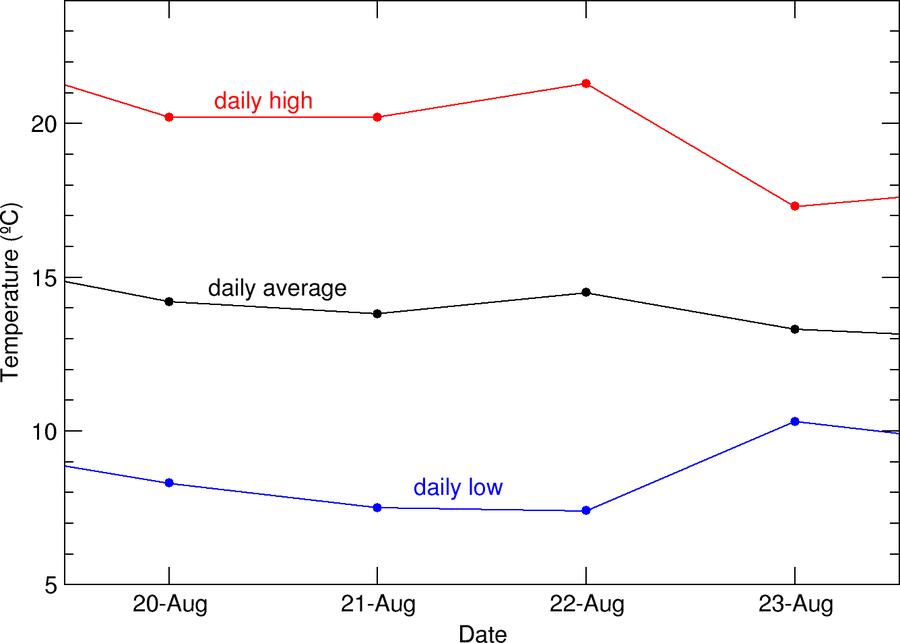
Figure 3: Changes in temperature throughout four selected days for the weather station of Jena, Germany.
The temperature changes throughout a day. In many regions on Earth, these changes can be rather large. In order to have a representative temperature value for a single day, the mean value or the average of the recorded values is calculated.
An average value is defined as a number that is the minimum of the sum of differences between the average and the individual values. In an ideal world, this sum of differences is zero.
If T stands for a given value of a temperature measurement, we can indicate a series of measurements by adding an index, like e.g. T1, T2, T3, … which corresponds to the first, second and third value, respectively. In order to calculate the average of a series of measurements, one has to calculate the sum of the individual values measured and divide by the number of measurements. With three temperature measurements, the average would calculate as:
Or in general:
T ̅ is the symbol for the temperature average, and n is any given natural number that corresponds to the number of measurements.
As seen below, there is also a variation of the daily mean temperature throughout the year. If one wants to say something about long term effects, like climate change, it is best to avoid confusion by short term variations, like the seasonal change during a year. In those cases, one often calculates the yearly average to facilitate comparing the changes from year to year.

Figure 4: Variation of daily temperature averages during three years for the weather station of Jena, Germany.
We have seen that calculating averages is one of the key skills needed in climatology. For the following tasks, you will use real weather data obtained from a public database. In the following steps, we will use the following example:
Data retrieved from German Weather Service (DWD)
Source: ftp://ftp-cdc.dwd.de/pub/CDC/observations_germany/climate/daily/kl/historical/
Data file: tageswerte_02444_18240101_20141231_hist.zip
Details of the weather station:
Jena Observatory (Germany)
Latitude: 50.9251° North
Longitude: 11.583° East
Altitude: 155 m
From those data, the following table shows for each day of June 2010:
- the daily mean temperature
- the daily amount of precipitation (typically: rainfall)
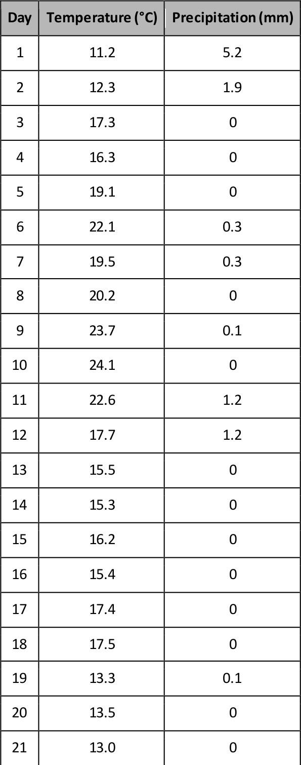

From this example, you can already see how drastically the values change from day to day. Indicate the highest and lowest values for temperature and precipitation. From this table, you will calculate:
- the mean temperature of June 2010
- the total amount of precipitation (rain) in June 2010
The result is a representative pair of values for the temperature and the precipitation in June 2010 for that example location. However, this is still not climate. The numbers can change even between years, but we would not assume that also the climate changes so rapidly.
It is generally accepted that climate is characterised by weather conditions averaged over several decades, typically 30 years. Therefore, the next table provides the average temperatures and total precipitation for all months of June from 1981 until 2010.


First, indicate the most extreme values (minimum and maximum) for both quantities and then calculate:
- the mean temperature
- the mean precipitation
These two value a representative of the expected or typical conditions during any June in the city of Jena.
Additional/alternative activity for skilled students:
If the students are familiar with spreadsheet software like Excel, they can transfer the tables and calculate the values there using the functions AVERAGE, SUM, and COUNT. As an alternative, the spreadsheet files can be prepared beforehand and handed to the students.
Activity 2: Climate charts
From the pure numbers, it is hard to judge the climatic situation of a given location. One possible tool to visualise the results is the climate chart according to Walter and Lieth. It is a graphical representation of the two main quantities that characterise weather and climate: the temperature and the precipitation. The chart shows one value for either of the two quantities for each month. The temperature is the mean temperature of a given month, while for the precipitation the sum is displayed.
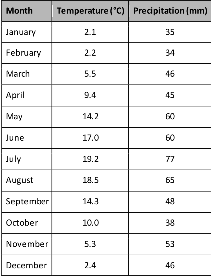
For explanatory reasons, an example for Rome in Italy is given. The chart is based on the following list of values, which represent a long term average of temperature and precipitation for each month.
The resulting climate chart according to Walter and Lieth is given as follows:
Figure 5: Climate chart for Rome, Italy. It illustrates the monthly mean temperatures and the corresponding added precipitation throughout the year (Source: Geoklima 2.1, https://heraldik-wiki.de/index.php?title=Datei:Klimadiagramm-deutsch-Roma_(Rom)-Italien.png, https://creativecommons.org/licenses/by-sa/3.0/legalcode).
The header of the chart for Rome lists some basic information about the location. Very often, it mentions the annual mean temperature and the summarised precipitation throughout the year. The chart itself has two scales, the red one to the left displaying the temperature in degrees Celsius, and the blue one to the right providing the precipitation (rainfall) in millimetres. For very high values of precipitation, the scale above 100 mm is compacted to steps of 100 mm (not in this example). The horizontal scale at the bottom lists the months through the year, abbreviated with the first letter of its name.
The red curve depicts the evolution of the temperature, averaged for a given month, as listed in the table above. The blue curve shows the evolution of precipitation as the sum calculated for a given month. The values are also listed in the table below. The red scale belongs to the red curve and the blue scale to the blue curve.
In order to able to derive climatic information from such a chart, the two scales must be adjusted so that 10°C correspond to 20 mm of precipitation, both aligned to zero. With this strategy, humid periods are those where the curve of precipitation is above the temperature curve. Arid periods are present, whenever the temperature curve is above the one representing precipitation. Usually, these periods are indicated by colouring the areas between the two curves. Blue upright lines depict humid periods, while arid periods are represented by a dotted pattern or a filled yellow area. If the scale for precipitation above 100 mm is compacted, the area above this value is generally indicated by a filled blue area (not in this example).
In the given example, we see the following features:
- The highest monthly temperatures (summer) are attained in the middle of the year. This means that the city of Rome is in the Northern Hemisphere.
- The curve that indicates rainfall is below the temperature curve during summer. This means that the summer is rather dry there. On the other hand, Rome is relatively humid throughout the rest of the year. This typical of a Mediterranean climate.
Coming back to the previous work, you will create such a climate chart for Jena in Germany. You had already prepared the necessary data points for June, a 30 year long average of temperature and rainfall. The following table provides the same for the remaining months.
Take the millimetre paper, the ruler, and the pens and draw the coordinate system of a climate chart as in the example for Rome above. Then:
- Calculate the annual mean temperature
- Calculate the annual total amount of precipitation
- Add the header information (station name, geographical data, annual values)
- Use the red pen and enter the data points for the temperature
- Use the blue pen and enter the data points for the precipitation
- Identify periods of humid and dry conditions
- Mark those periods accordingly (blue lines, yellow area)
Characterise the climate in Jena. Can you guess if it is in the northern or in the southern hemisphere?
Activity 3: Derive your local climate chart (for advanced students only)
There are weather data available for almost any location and area around the world. Use the links below to find the suitable weather station from which you can derive the climate data that are needed to construct your local climate chart.
USA and World:
http://www.ncdc.noaa.gov/cdo-web/datatools
UK:
http://www.metoffice.gov.uk/public/weather/climate-historic/#?tab=climateHistoric
Germany:
ftp://ftp-cdc.dwd.de/pub/CDC/
The first difficulty is to find a suitable weather station next to your location with enough data coverage for a long period. They should include temperature and precipitation for a continuous period of at least 20 years.
The second challenge may be to format the data into a form that is suitable for your work. The display of weather data can be varying, and the units may also differ.
The data can be overwhelming. Some experience with using spreadsheet software would be an advantage. Note that you will have to calculate averages and sums along various periods (day, month, years). You need:
- Daily mean temperature and total precipitation
- Monthly mean temperature and total precipitation
- 20/30 years mean temperature and mean precipitation per month
After finalising the climate chart, compare the result with your own experience. Do the temperature and precipitation follow your expectations?
Lehrplan
Space Awareness curricula topics (EU and South Africa)
Our fragile planet, Atmosphere
Fazit
The students learn to analyse interpret scientific weather data and how they can be used to characterise the local climate. They apply the statistical tool of averaging and learn to construct and use the climate charts.
This resource was developed by Markus Nielbock, Haus der Astronomie, Heidelberg, Germany. This resource is under peer-review, proof reading, and will be updated and improved in the coming year.

